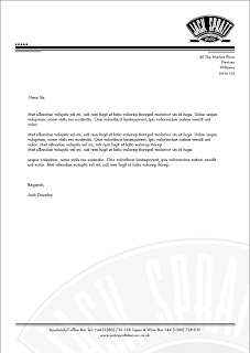
This is the letterhead I have decided to take forward. It displays the logo in the centre of the page. Something that I think reflects the sign that will be placed outside the shop. It is subtleties like this that I think are important when it comes to designing for eateries such as cafes.
This is an aspect of the design that will have to be carries on through to the rest of the design.
The watermark is something in the design that I am keen to implement. But other decisions.... and i keep saying this so I really need do it. Stock choice will decide whether design choices such as the watermark are appropriate or not.


No comments:
Post a Comment