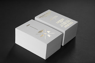
These business cards have all had excellent finishes given to them to make an already good looking design look even better.
As the logo I have designed for Jack Spratt is black & white I am looking to add a spot varnish to make the black bounce of the stock well.
This will give the establishment and design some more class, suited for the Art Deco era.


No comments:
Post a Comment