As the IMDB Supplement was going top be telling the story of film using primarily Actors and Directors I thought It would be appropriate to design an information graphic that would support the editorial content.
Looking at the relationships between the actors and directors would be a great way to visualise the data that the viewer would simultaneously be reading along side.
These are some of the ways in which the data could be displayed.
The example above shows how the information could be displayed in a almost choatic way spreading through out a page in random directions with links spanning the entire double page spread.
As there are only 2 main types of data I thinks this way of displaying the information would not work. If there where many different catagories of information it could be exciting to see the story emerge from the data.
This diagram shows how the 2 categories of information could cross over forming patterns.
However I am put off by this idea because it seems to much like a diagram, too simple and 1 dimensional
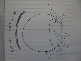
This is the idea I want to take forward. Actors and directors could be arranged in alphabetical order around a circle with lines linking the relationships between them.
The circle would also act as a cage for the dat keeping it regimented and ordered but allowing for interesting things to happen in the middle.
Other linear information such as dates and timelines that have relevence to the core information could then be placed around the outside.


No comments:
Post a Comment