
These images show variations of the two final designs I want to go forward with for the jack spratt business card. At the moment I have had better feedback from the business card on the left becasue it adds a contrast to either side and also brings out the monochromatic tones of the logo.
The three screenshots at the top of the post make use of the floral borders like the menus did to foucus the viewers eyes on the most important information.
However I don't think this works on a business card because it is too small and your eyes are already draawn to the logo because its the only thing on the front.


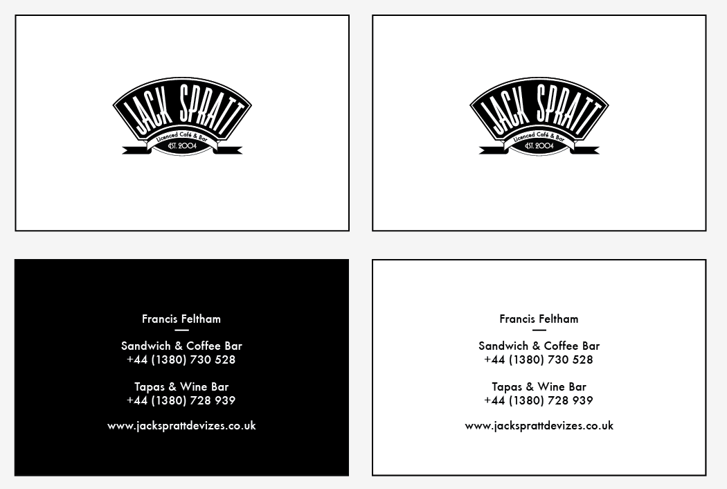

This is the final format design I have chosen for the business card. It is simple and has all the information centralised and in in the same position either side. The floral borders have been removed because I felt that they cluttered up what is already a small space to work on.
No comments:
Post a Comment