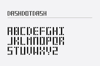
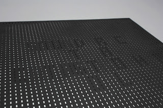
One of my favourite typefaces so far. This technical and very processed driven machine like typeface has been designed for an album sleeve and delivers the typeface in a motion like format when the record is removed from the sleeve.
A very technical driven type that delivers on a number of levels including a fairly ironic sence if you take into consideration what name of the publication is called.
To be able to create a product that that works on a number of dimensions and that engages with people to a level of this standard is very important and something that I will be looking at when designing my design context book.


No comments:
Post a Comment