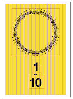
When starting the up the document in indesign there were many questions that I had to ask my self about the overall outcome of the document.
Print can become so complicated at times...
The margins would need to allow for the ring binder. This was the wire bound method of binding the publication that I had chosen. To allow for this I decided to keep the inside margin 20mm and the others 10.
This would have to be changed depending on which page I was working on because I was not working on facing pages. it confused me slightly.
The design I wanted was to be stripped back and minimal, this would compliment the design of the infographics well.
A minimal cover printed on acetate which would be layered on yellow.
The scale with the number of films featured highlighted beneath. This would be visible through all layers of the acetate.


No comments:
Post a Comment