


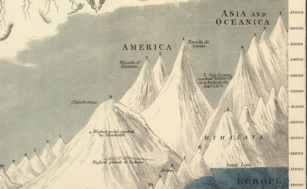
This victorian info-graphic was created in 1854 and shows detailed and technical drawing of mountains and rivers from around the world, both of which are showed in ascending order.
The use of such detail is something that surprises me because of the era they were created and puts the pixel based work that we see today to shame.


This info-graphic depicts Napoleons disastrous march on Moscow in 1812, which decimated his army. The wide, tan band up top shows the of his army, shrinking as it approaches Moscow (the end point on the right). The black band shows the size of his army during the retreat; the troops get whittled down to nothing. (The line chart below shoes the temperature in each position.

This info-graphic shows the causes of death for soldiers in the east army. The info-graphic was actually created by florence Nightingale who was also a genius mathematician as well as damn fine nurse. She was also the first person to use this method of displaying information. The polar grid system.
No comments:
Post a Comment