

Above is one of my favourite typefaces. I have come to use this typeface a lot in my work because it impacting but doesn't take too much away from the work that it is accompanied with.

I decided to modify the typeface so that it was little less sharp. I decided to do this because I thought it would reflect the gentle slopes of a sand dune and this would therefore make it appropriate for my book jacket. At first I started by smoothing the outside points of the letters.
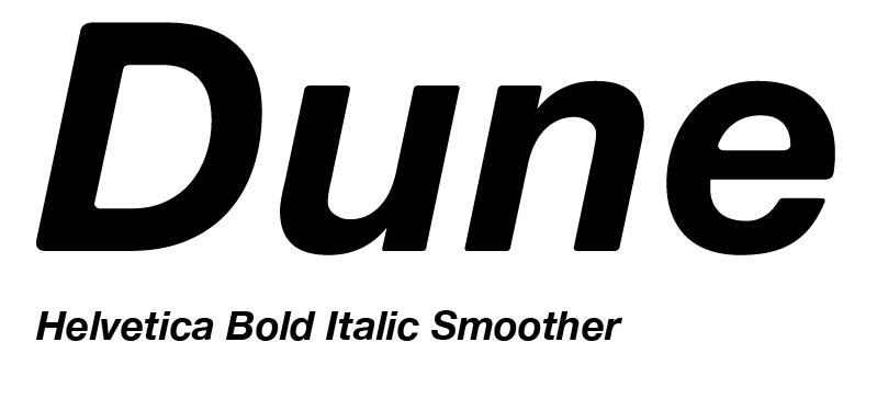
I then smoothed out the lines on the inside of the 'D' and the 'e'. Still not smooth enough....

Finally I smoothed the lines in the 'n' and the 'u' to achieve ultra smoothness.
No comments:
Post a Comment